
This has contributed to the drive of the enterprise video market, with projections estimating that it will be worth $48.85 billion by 2030.
As the need and volume of video in enterprise environments grow, so does the need to manage video content in a centralized portal, as well as the need for video analytics to monitor and track video consumption across the organization. Luckily, those two don't have to be mutually exclusive.
VIDIZMO EnterpriseTube, a Gartner-recognized enterprise video management solution, offers data-driven insights into both ends of video content analytics. In this blog, we'll explore how these analytics work and how they can be leveraged to their full potential.
Why Organizations Need Video Analytics
Enterprises serving video content to audiences, whether they're training employees, promoting products, or delivering educational content, need analytics to go beyond simply creating and putting out videos.
Specifics into how content performs, which audience it has an impact on, and where and how it's being consumed help businesses gain valuable insights to shape their content strategy.
Without this data, organizations can find themselves flying blind, unsure of what resonates and what falls flat.
By leveraging analytics, companies can transform video from a cost center into a strategic tool for driving engagement, understanding their audience, and achieving specific goals.
This also applies to the analytics regarding the streaming and performance of videos. In a State of Online Video report, we can see that 44 percent of global consumers noted video buffering as their primary issue with watching online video.
Understanding Video Analytics in EnterpriseTube
Recognizing the need for diverse data on videos, EnterpriseTube offers a full suite of analytics that dig down to the specifics of videos. These analytics are segregated into the following categories:
- Video analytics: These analytics include insights into how videos are being consumed and how they are performing.
- Media analytics: These analytics give an overview of how users are engaging with the content, user experience on the portal, and top media and users.
- Media Quality of Experience (QoE): QoE analytics provide insights into the video streaming experience the end-user is receiving and, more specifically, how reliably the network performs.
- Livestream analytics: These analytics provide granular insights on live streams, including engagement data, user-level analytics, heatmaps, and more.
- Interactivity reports: These analytics show responses to surveys and quizzes embedded in videos.
- Federated analytics: These analytics outline analytical data gathered from integrated third-party applications such as CMS, LMS, CRM, etc., alongside media analytics from VIDIZMO, presented from a centralized VIDIZMO analytics dashboard.
Video Analytics
Video analytics enable businesses to use data to optimize content, update it wherever it has been published, and implement A/B testing for continuous improvement.
Thanks to video analytics software such as EnterpriseTube, organizations can stay better informed on how existing assets are performing and how future content decisions should be made.
For instance, if only half of viewers are making it to the end of a particular video, there may be a need to reevaluate the length and content of similar videos in the future to better engage viewers. These viewer drop-offs can be in the VIDIZMO Media Analytics dashboard via the heat map widget:

The widget tracks 5-second chunks of content and displays the heat map timeline, as seen in the screenshot above. This data can also be viewed in tabular form, as can every other form of analytics available on VIDIZMO EnterpriseTube:

From the data above, it appears that the ‘Corporate Social Responsibility’ video is doing reasonably well, with no drop-offs until the concluding 5 seconds. Views are picking up around the 25-second mark, making the next 10 seconds the most important part of the video. For optimization purposes, we could look at the content covered from 00:20 – 00:30 and expand on it, because users seem to be most interested in the information at this point. This is the sort of insight a business can uncover using VIDIZMO analytics, focusing on providing users actionable data to improve business video consumption.
There is a lot more information in the Analytics dashboard, apart from the heatmap. All the analytics go hand in hand and together paint a complete picture of viewership. You could say they act as pieces of a puzzle. This information includes the following:

Total number of views and viewers
The number of total views and unique viewers in EnterpriseTube gives insights into how far video content has reached. This is helpful when expecting a certain number of people to watch the video.
For instance, if a company-wide announcement for all employees is broadcast, you can tell whether all your employees watched the video or not by tallying the number of viewers with the number of employees.

Number of Impressions
Impressions include insights about when the video page was loaded. However, these video content analytics don't count video playback. They only count the number of times the link to a particular video was accessed.
Together with the number of views and viewers, these analytics can be helpful in determining how many people clicked on the video but didn't watch it. This could offer a jumping off point to investigate into deeper issues such as the video refusing to load or network issues.

Completions
In EnterpriseTube, the number of completions reports how many viewers went through the entirety of the video. When paired with total views and viewers, they give a complete picture of how many of the viewers actually completed the whole video.

Total time played
This metric represents the total time, in minutes, that a video was played, compounded for all the views, regardless of completion. In other words, this metric reflects the video's playback in length of time.
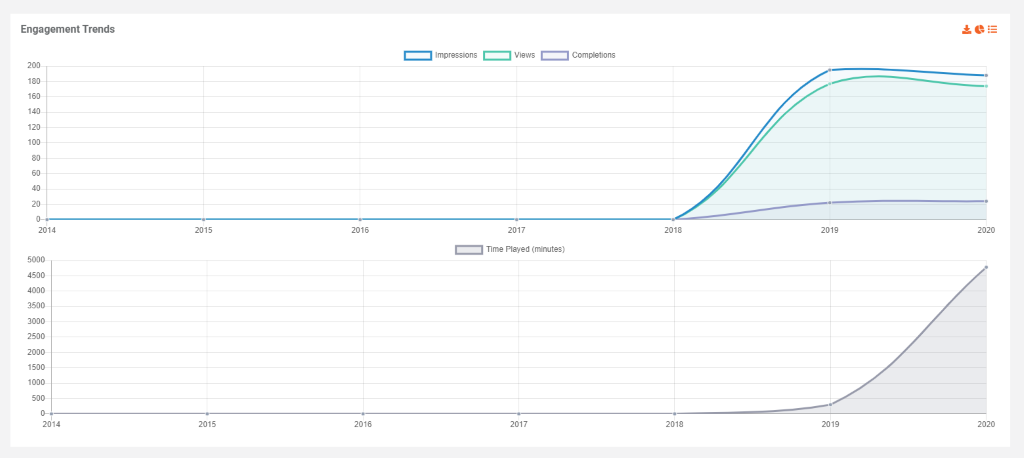
All these metrics are shown plotted against time on a graph or in a table, which makes for a simple and convenient trend analysis by showing how the metrics change over time and the peak time of viewership. Such actionable insights can be used when planning future videos of a similar nature.
Likes and comments
Likes and comments on a video suggest how compelling the content of the video was found to be by the viewers to drive them to interact with the video and leave feedback or participate in discussions.

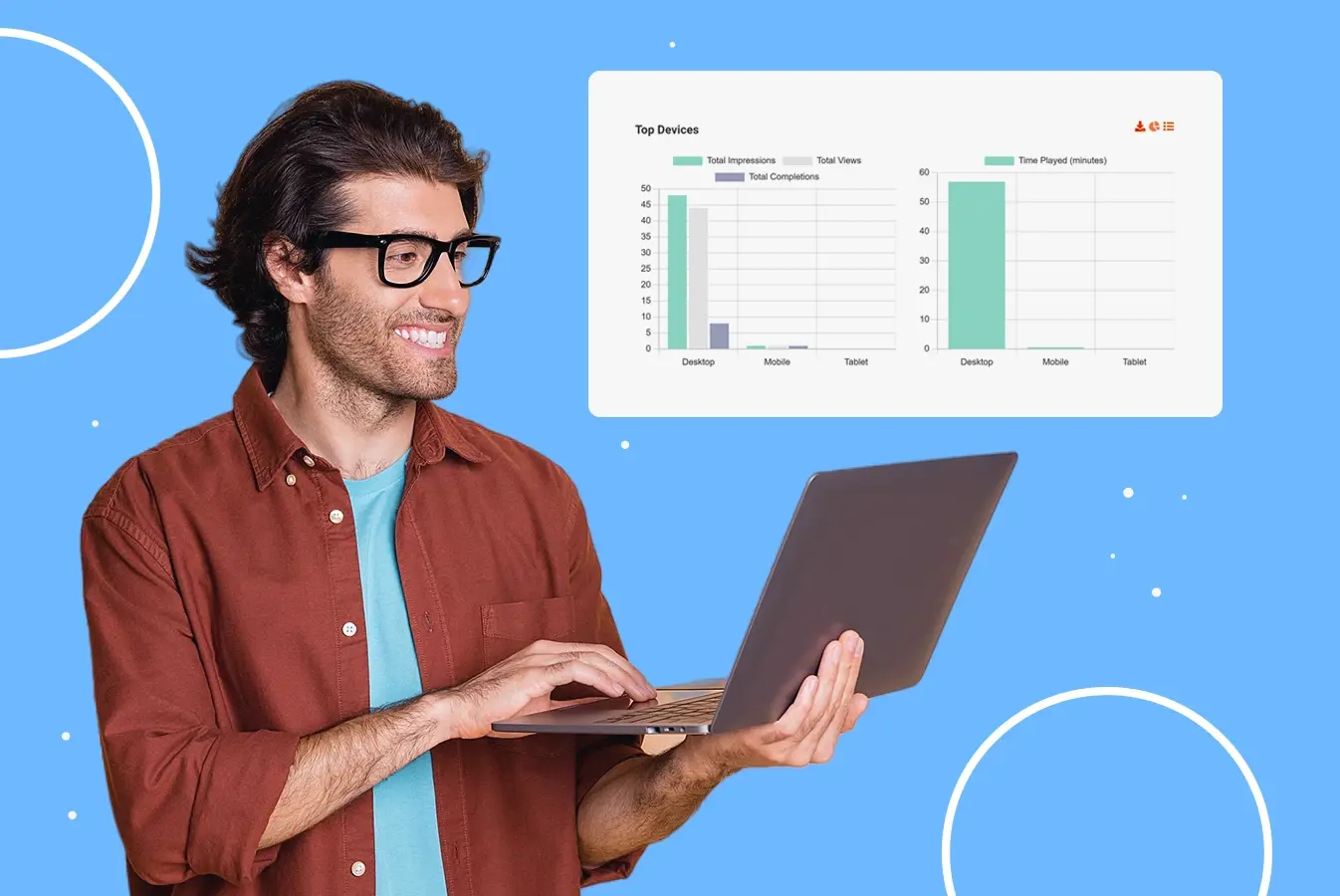
Top Devices
Since VIDIZMO EnterpriseTube is adaptable over a range of devices, viewers can choose which device they wish to view a video on based on their convenience.
As part of EnterpriseTube's video analytics platform, users can see which device – desktop, mobile or tablet – the video had the most views, impressions, completions, and time played on. This can be helpful in optimizing the video for the most popular device.

Similarly, users can view analytics that represent the popularity of web browsers, which can also be viewed in tabular or graphical form.

Number of embeds
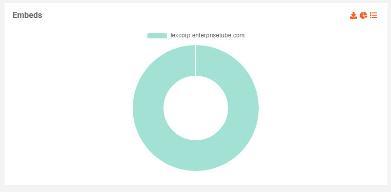
EnterpriseTube offers users the ability to embed media outside of the portal, such as social media platforms or websites, to reach a certain audience. These analytics can reflect all the places where the video was embedded, which helps content creators consider the audience on those web pages when making similar video content in the future.
Demographics
The geographic heatmap in EnterpriseTube's video analytics platform reflects the popularity of the video geographically. This data can help in making the video more accessible for the areas where the video performs well by expanding the distribution network or offering additional language settings.
Media Analytics
On top of individual analytics for videos, VIDIZMO EnterpriseTube also comes equipped with video content analytics for all the media in the portal. These include similar details as analytics for videos, except with an overall view of all media on the platform. Plus, the portal's Report Dashboard also gives a set of unique information which includes:


Total views
Similar to individual analytics, the total views in EnterpriseTube represent the overall views of the portal, broken down into two statistics: views by registered viewers and views by external, anonymous viewers.
You also get a look at how many individual, unique viewers watched the media on your portal.

Top media, contributor & registered user
EnterpriseTube allows users to view a list of the top media in order of the views it received, most to least. This gives you a look into your most popular videos, and you can analyze why they performed so well and how you can design other videos to be similarly received. It could be because of an attention-grabbing title, an eye-catching thumbnail, or just a popular subject matter that more people are interested in.
Another list of top media arranges the media in order of most interactions – likes, favorites, comments, shares, and downloads – which gives a look into which of the videos was the most engaging. Users could be engaged by the subject of the video, its delivery, or a multitude of other factors.
Similarly, a list of top contributors simply shows which contributors uploaded the most videos in your portal, and top registered users show which users showed the most interest in the content.

Media summary
In the media summary table, users can get an overview of each video in terms of impressions, views, completions, and time played. You can use this table to sort the data in ascending or descending order and analyze the different ratios, such as impressions to views or views to completions, to evaluate the performance of your video or portal.

You can also view this table in terms of interactivity – likes, comments, favorites, shares, downloads, and embeds – to further evaluate which of your videos was most and least engaging and why.

User summary
The user activity summary table in EnterpriseTube shows the impressions, views, completions, and time played by individual users. Using this, users can gauge which of their viewers had the best and the worst experience with the portal by analyzing similar ratios as in media summary.

Just as with media summary, you can view the table in terms of interactivity as well and see which of your users was most engaged with the portal media.
Total favorites and shares on the entire portal
EnterpriseTube's cloud based video analytics capabilities provide a number of total favorites and shares as well, which represent the total number of times the viewers interacted with the video by pressing the favorite button and sharing it with their colleagues.

Recent activity by users
Recent activity gives you a transparent view of users' activity on the portal, such as likes, comments, and shares. The activity is shown for the period for which you select to view the analytics.
You can use these updates to keep track of activities occurring on the portal and to respond quickly to any that may require attention. For example, if a viewer asks a question in the comment section of a video, you can see it and respond promptly.
Portal statistics
EnterpriseTube tracks downloads, embeds, and form submissions, giving you a clear picture of how your content travels. See how often your videos are downloaded for offline viewing, shared on social media through embeds, and how many viewers engage with your interactive surveys and quizzes uploaded to the portal.

Interactivity trends
A trend of interactivity with the portal – favorites, shares, and downloads – can be viewed in graphical or tabular form, which can help you analyze the point in time at which your portal engaged the most viewers. Time can be days, weeks, months, or years, depending on the period you select to view the analytics for.

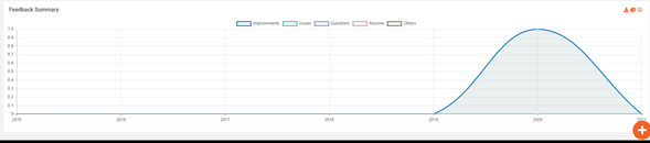
Feedback summary
Feedback summary represents the number of queries or concerns you have received regarding the content on your portal over time. You can check this data to see if the concerns decreased in number when you've addressed them.
Besides analyzing content consumption, you can also look at how your media is performing from a network standpoint with the VIDIZMO Media Quality of Experience (QoE) dashboard.
Media Quality of Experience (QoE) Monitoring
Keeping your audience engaged requires more than just great content. Media Quality of Experience (QoE) Monitoring has become crucial for businesses delivering video content.
Video quality can degrade or get interrupted at any point across the transmission path. This could translate to frequent buffering during playback, device-specific errors, or a low-quality playback experience.
For a business, identifying and rectifying the issues is important to avoid a drop in viewership and continue engaging viewers.
To remedy this, VIDIZMO EnterpriseTube allows organizations to gauge the streaming experience in the QoE dashboard to analyze and optimize videos accordingly.
Here are the main types of analytics you can use to measure performance within the VIDIZMO QoE dashboard:
Time Played
Similar to the time played metric in video content analytics, the time played figure in Media QoE shows the consumption of the video in length of time. Depending on the period defined, this can be in seconds, minutes, or hours.

Player load time
The average time taken to load the first frame of the video is helpful in understanding how long a video generally takes to playback. This is shown in a bar graph and represents how long the player takes to load on an internal as well as an external network. You can use this information to evaluate the efficiency of your network and analyze potential problems.


Cache hit ratio
As part of the cache hit ratio, EnterpriseTube allows users to view requests received by Origin and Edge servers across the network. This gives businesses insights into expanding their delivery network to accommodate more viewers.

Buffering
With the buffering stats, users can see how much the player stopped to buffer as a percentage of the video's run time. This metric is an average of all the viewers' experiences and is also presented broken down for devices.
This is shown as a geographical heatmap which also goes down to specific geographical areas that face buffering. Using this information, organizations can evaluate their portal's connectivity on certain devices and in certain locations and optimize them accordingly.
Error
Apart from buffering, a video player may even stop playing the video altogether. The QoE dashboard gives a count of how many times the player failed to play a video.
These errors could indicate several underlying issues such as network disconnection from the video source, video unavailability, player crashes, etc.

Video quality playing
For the entire playback duration of a video, EnterpriseTube lets users see how much of it was viewed in which resolution – 240p, 360p, 480p, 720p, or 1080p. This gives you a peek into the strength of your viewers' internet connection and the bandwidth available to them.

Additionally, you can view all this information consolidated for the entire portal in the portal's Reports Dashboard.
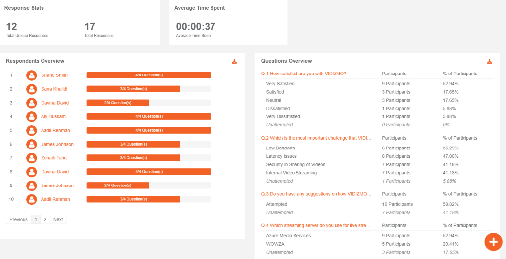
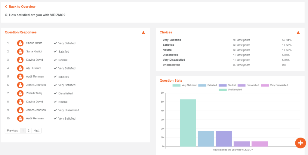
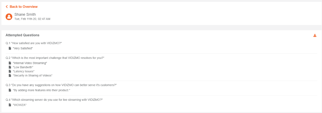
Interactivity reports
Another source of information on videos includes reports of interactive elements embedded in the video, such as surveys, quizzes, and handouts. This gives a look into how many viewers participated in interactive actions on your portal. Interactivity reports can even show individual registered users who took part in interactive actions.
Survey
Overall report
Question-based report
User-based report
Quiz
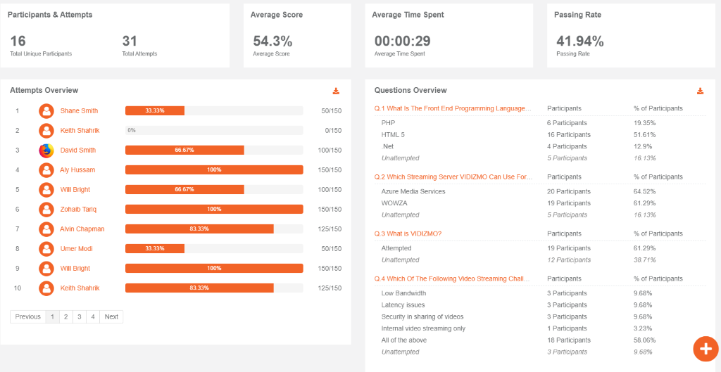
Overall report
User-based report
Furthermore, surveys and quizzes can be used to take the viewers' feedback on their viewing experience and to gauge the understanding of the concepts delivered in the video. These reports provide a deeper insight through viewers' responses to individual questions.
Livestream analytics
-
A live stream can be controlled and monitored, which also provides insights that are unique to live streams. A graph represents a set of data updated in real-time that includes:
- Current live views: This number represents viewers that are currently viewing the live stream.
- Total unique viewers: This represents the accumulated number of unique viewers that have engaged in the live stream so far, regardless of whether they are still tuned in.
- Total views: This represents the aggregated number of views the live session has received so far.

Just as with on-demand videos, the surveys, quizzes, and handouts can be added to the recorded livestream at any time. The "reports" tab will show the number of attempts, passes, and fails on a quiz, and the number of responses on a survey as the user submits the responses.
Federated Analytics
For any integrated third-party business applications such as CRM or CMS, VIDIZMO EnterpriseTube offers federated analytics to provide media-related statistics of videos and other digital media embedded or shared to the integrated third-party platforms.
As a result, VIDIZMO can track detailed media analytics regardless of which platform the media is embedded on. For instance, as part of an integration with a corporate CRM such as HubSpot or Salesforce, VIDIZMO tracks and displays analytics of video performance as part of the marketing or sales campaigns executed from the CRM.
Depending on the scope of a CRM integration, EnterpriseTube can also provide holistic analytical data, let's say for a marketing campaign, gathered by the CRM alongside the media analytics data tracked and recorded by EnterpriseTube.
This would include rich media analytics of video used as part of the CRM for the marketing campaigns alongside broader marketing stats gathered by the CRM. In a federated analytics scenario, all such data would be accessible from a centralized cloud based video analytics dashboard.
Improve Your Video Strategy with VIDIZMO EnterpriseTube
Looking to increase the adoption of video across the enterprise and optimize the viewing experience?
VIDIZMO EnterpriseTube offers an out-of-the-box video analytics software and end-to-end video solution for the forward-thinking enterprise, from an intuitive and highly configurable video portal with AI-enabled search to managing content delivery and video workflows to in-depth video analytics for continuous improvement.
With EnterpriseTube, you can:
- Enjoy a centralized dashboard to securely store, access, and share content.
- Benefit from in-depth analytics outlining all user and audience-based metrics to track the performance of uploaded content.
- Secure portal and media access behind role-based access management
- Use state-of-the-art Enterprise Content Delivery Network (eCDN) to reduce delivery and loading times, making content globally accessible
- Use AI-enhanced search for quick discovery to identify relevant content within seconds using metadata, labels, objects, authors, speakers, or any other in-content keywords
The key to maximizing ROI from your enterprise video content strategy is to keep reviewing data constantly to gain knowledge on how you can increase video adoption and consumption, optimize the network, and embrace digital transformation completely.
Try EnterpriseTube using a 7-day free trial to experience these powerful analytics features! Still unsure? Contact us today to see how we can meet your needs.
People also ask
1. How do you analyze video content?
Analyzing video content requires the use of video content analytics that give you details about your content performance and consumption. From there, you can develop strategies to reach your desired metrics.
2. What is the objective of using analytics in video?
The primary objective of using analytics in video is to extract valuable insights from video data. This includes understanding viewer behavior, improving content engagement, and enhancing performance by detecting anomalies and errors.
3. What is intelligent video analysis?
Intelligent video analysis refers to the use of advanced algorithms to analyze video data. It involves extracting meaningful insights, such as the cache hit ratio of a video platform, to determine if the CDN is dispersing content to viewers globally.
4. What are video analytics?
Video analytics refers to the process of automatically analyzing video content to extract useful information. This includes generating insights to improve decision-making and efficiency.
5. How do you measure video views?
Video views are typically measured by tracking the number of times a video has been loaded or played.